A design system for social media can give your brand or business a powerful way to scale your organic content and advertising in tandem, while maintaining a cohesive identity across an endless buffet of social media platforms. Don’t worry if you’re not a graphic designer or illustrator, anyone can create a Design System for their brand or business, you don’t need any special software to do it. We’ve broken down the steps below that will help you get started.
What are the key steps to building a design system for social media?
Step 1: Conducting a visual audit
The first step in building any design system for social media is to do a visual audit of your current look and feel, whether that’s the design of your website, your social feed, and app, or some other digital download. Take note of the platforms that are successfully being used (Instagram, WordPress, Shopify etc) and the visual elements can help you gauge how much of an undertaking this process might be. Make note of what you like and what you dislike about your current look, and what content has been well received by your audience.
While tempting to be “everywhere” on social media, It is always better to succeed at one platform than to struggle on several fronts. If you’re not using twitter or your blog, it may be better to discontinue those channels and put your focus where it gives the best return on your effort. Similarly, if you hate the way your storefront looks on a platform, a visual refresh might be the tipping point needed to upgrade or migrate to something more your liking.
If you’re not ready for this step yet, or you have yet to launch your brand, read more on how to find your perfect audience before diving into creating a design system for social media for your brand. You’ll need to know WHO you’re talking to before you start anything!
Step 2: Create a visual design language
The visual language is the core of a design system for social media. It’s made up of the components that you’ll use to construct your content or products.
Any visual design language is made up of four basic categories, and you should consider the role each of these design elements plays in every component of your products.
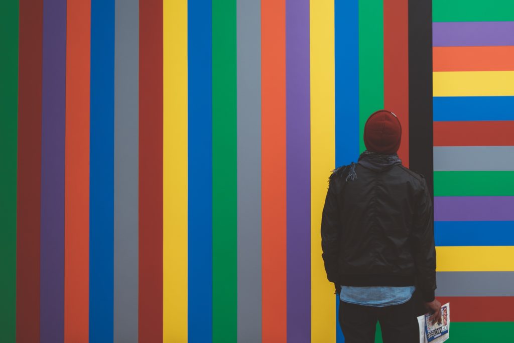
Photo by Mario Gogh on Unsplash
Colour
Obvious, right? Common colours in a design system include 1–3 primaries that represent your brand. You may want to include a range of tints (colours mixed with white—or shades—a colours mixed with black or white at 50% opacity —to give your designs a few more options. Tools like Coolors or Adobe Color are both free and a great way to start playing with palettes and complimentary colours hands on.
Typography
Most design systems include just 2 fonts: 1 font for both headings and visual element titles (things like pop-ups or widgets on a website), and a monospace font for body content. For a successful design system for social media, Keep it simple. To avoid confusing your user, keep the number of fonts low and keep them simple, it’s not only a best practice of typographic design, it also prevents issues caused by web fonts not displaying for all users in all environments. An essential starting point to selecting type is to find a library, like Google Fonts or Adobe’s TypeKit.
Sizing and spacing
The system you use for spacing and sizing looks best when you have balance. To speed up this process, it helps to think of your designs in three “densities” that serve unique purposes beyond just a design system for social media: remember, you’re visual identity must be maintained anywhere there’s a touch-point with your customer.
- Small: high-density text without images or icons, for frequently used interfaces on websites or content that integrates considerable text. Best suited for e-commerce websites, email and applications.
- Medium: a default for many platforms (Instagram, Facebook, LinkedIN) and long-form reading experiences for any range of consumer, business, and internal content. This size usually blend text and images and allows for a combination of both a heading and short text content.
- Large: photo forward, content-rich marketing, promotions, and one-time data entry for new customers online and other single focused messages. This size will usually contain only a heading or icon and no body content.
In your designs, set your margins to be the same for all social platforms based on percentages or points, not pixels, to avoid problems across different screen sizes, or use columns, fractions (1/3rd, 1/2 etc) to maintain a consistent look regardless of boundaries. Before considering any of these sizes, it’s always recommended to bookmark Sprout’s excellent, and always up to day, Social Media Image Size Guide.
Imagery and Photography
The key to success with imagery and photography in your visual design language is having a plan and sticking to it. For any design system for social media, set guidelines for photos and illustrations, and use the best image format for the situation. Create a Pinterest or moodboard with both photos that you feel represent your visual language and a separate board for ones that do NOT.
Using free photo sites like Unsplash or Pexels can be a great starting point, but always be careful when it comes to using these photos in your final product. It’s better to always pay for proper licensed stock photography, or, hire a photographer before going live with your new design system for social media.
Step 3: Create a icon and pattern library
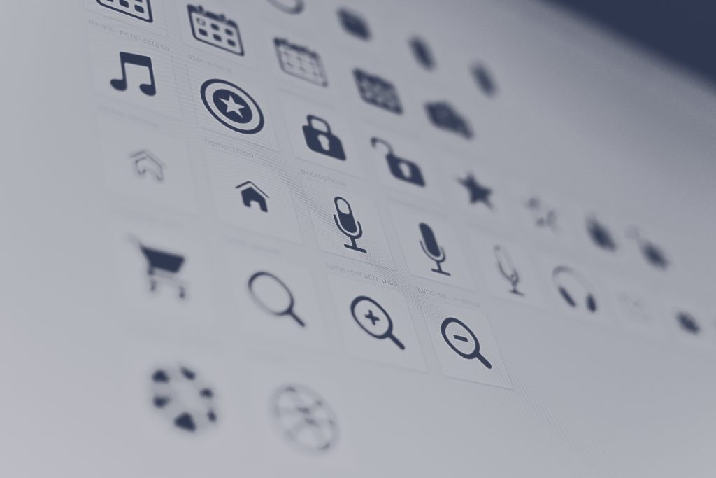
Photo by Harpal Singh on Unsplash
Unlike the visual audit you’ve already conducted (which looked at the visual qualities of your design elements), this step in the process looks at usable components of your design system and how to streamline them.
Select, at most, 3 patterns that can be used to add depth to your design system. Choose a set of icons (no more than 12-15 total) to represent your brands products, your content topics or other categories. You can choose icons from a free library like Flaticon for inspiration, or, if the license allows, use them across your designs from day one.
Icons and patterns are extremely important for any design system for social media. When combined with your previous colours and imagery, you can create an almost endless amount of visual content for your brand while breaking out of using too much text.
Step 4: Document what each component is and when to use it
This step is super important.
In fact, it’s the most important step to creating a design system for social media.
Documentation and standards are what separate a pattern library from a true design system. First and foremost, a design system is NOT a set of templates.
A design system combines all the visual elements of your brand or business to be a “single source of truth”, It doesn’t matter how you choose to lay it out. It can be a simple document or pdf, a Notion page, or something specialized, like InVision Design System Manager. What matters is that your design system for social media is followed for each and every post, advertisement or product you create.
Before beginning work on your design system, take a moment to think about the people you’ll need to bring it to life. Can you design it yourself? Who needs to be involved? You’re going to need more than just graphic designers: a design system needs to consider things like platform suitability, audience targeting, website design, ad buying and much more.
And remember, if you need still need help creating a design system for social media, we’re only an email away.
Header Photo by KOBU Agency on Unsplash