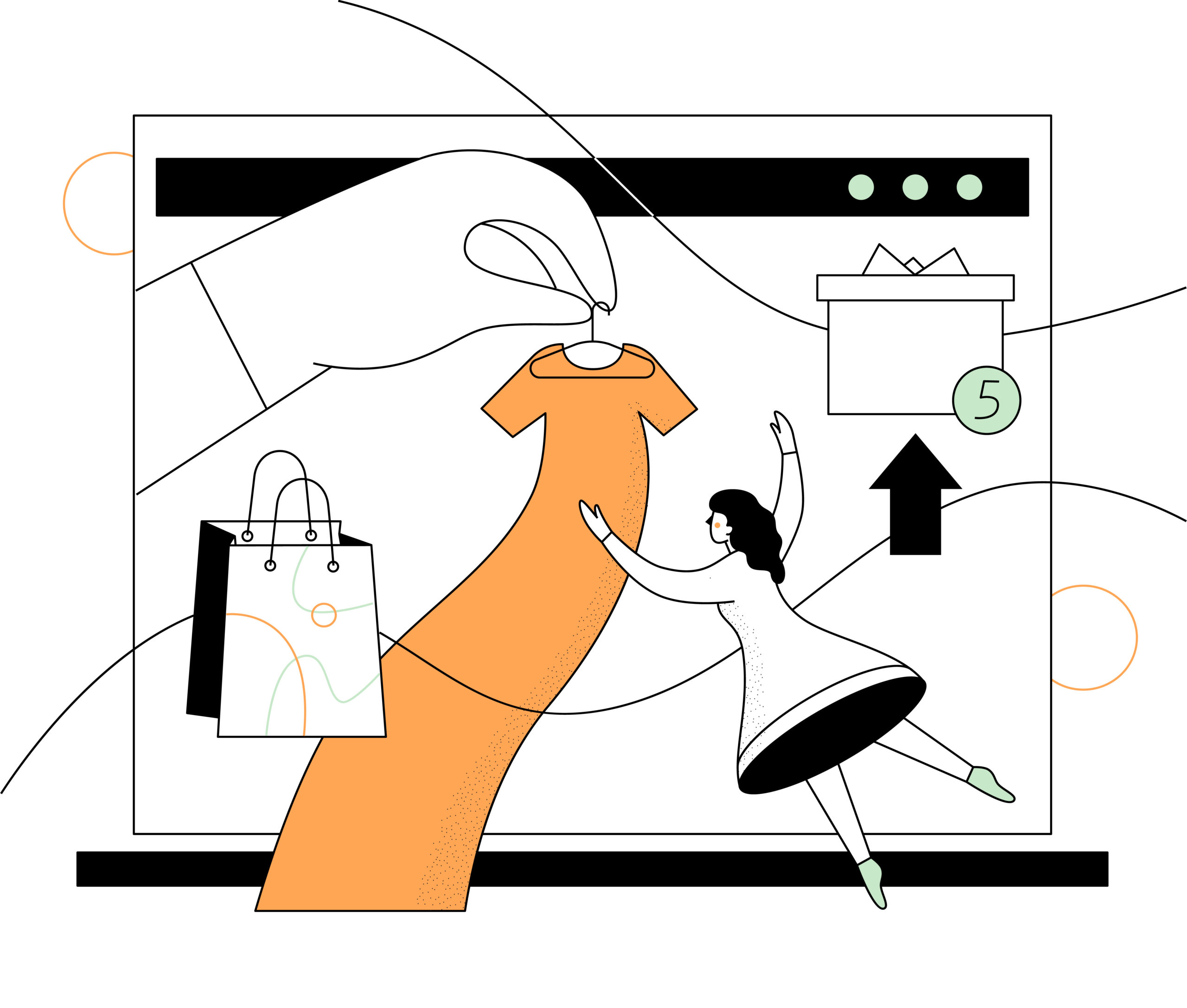
We hear you: when designing your online store it’s hard not to focus on the homepage.
Yes, the homepage is the first thing visitors see when they arrive… to your homepage, but we both know it’s really your product pages that close the deal. The true goal of any E-commerce website is sales, and there’s no way you’ll convert your curious audience into satisfied customers without high quality product pages. In fact, it might be the most important part of your E-Commerce or DTC experience.
When consumers are prepared to make a purchase on a website or mobile app, Episerver’s “Re-imagining Commerce” Report found 60 percent go directly to the product page for the item they’re looking for. That’s a number your brand can’t afford to ignore.
Effective product pages not only convey the value of a product, but also help build your brand and create trust with customers. They show potential customers the look of your product, tells them what it feels like, and makes them trust that this is the right choice for them. If your homepage is the storefront, your product page is your salesperson, and a good salesperson is essential for any retailer.
The Episerver report has an ever more startling statistic: 98 percent of shoppers have been dissuaded from completing a purchase because of incomplete or incorrect content on a brand’s website, underscoring the need for well written, accurate, and up to date product pages.
Done right, product pages feel as much a part of your brand as a logo or packaging, and give a great place to share social proof without being pushy.

Product Pages: what makes a great product page?
You might think that the secret behind a great product page is some arcane SEO trickery, flash videos or manipulative UX design, but nothing could be further from the truth.
In fact, product pages are pretty straightforward.
You want to highlight the product, give your audience the right amount of information to help them buy something they want, and convince them that buying this product is going to be simple and satisfying, turning the curious visitor into a customer as smoothly as possible.
As Rosara Joseph, Content Strategist at VentureWeb puts it,
“The paramount goal for your product pages should be to build user confidence by providing all the information necessary for a purchasing decision and making the process as intuitive and straightforward as possible.”
But if you’re thinking that’s easier said than done, fear not, we’re going to break down the ingredients behind a few great product pages so you can add them to your own recipe for selling success.
I know what you’re thinking: With so many options, where do you even start?
Product pages can be broken down into 5 key areas, and only when these 5 things come together can you create a truly great product page:
- Your product the star of the show: but what product you’re selling might change how it’s presented—and what questions your customers have before they can commit to buying. You’ve got one chance to make a first impression, so your product photos, packaging, and presentation are paramount to how it’s received.
- Your brand is the most important part of your business: from social post, display ads and even your post-sale emails it’s everywhere, but it’s especially important on your product pages. With the way products are discovered these days, someone might never see your homepage before buying from you, so branding on your pages matters. Remember that even little things like colours or the amount of white space you use in your layout can have a psychological impact on how your brand is perceived.
- Your copy is important, because it’s how you combine the written information your customers need with your brand’s unique voice and tone. Too much copy (text) leaves customer’s dazed and confused, too little leaves them unsatisfied and frustrated, so make sure you remember your audience and what they will want to know.
- Your Social Proof What are people saying about the product? Social proof is essential in the digital economy to build trust. This doesn’t only mean reviews: press, video demos and more can go a long way to build buyer confidence and build your brand bank.
- Your page design, and your user experience, is going to be informed by all of these things, but there are nuances involved, especially from the user’s perspective. How things are arranged on the page, and what’s included, can have a big impact on your conversions. Things like sizing, colour or subscriptions can be an integral part of your product, so relegating them to an afterthought will only increase friction for your potential customers. Offering payment options can help sweeten the deal, so where they’re presented on your product pages can have a lasting impact on the buying decision.
But before we begin…Do you have a good understanding of your customer?

To make any of these decisions well, from how much detail to include, to which product attributes to highlight in your photography, you need to really understand who your customer is and what they want from you. If you’re still unsure, you’ll need to identify your audience before going any further.
Understanding your audience, and meeting their desires through the design of your brand, is the most important factor to any E-commerce retailer.
“We created a multifaceted character named Phoebe James that reflected the brand (Phoebe James) principles. We worked to create Phoebe’s world – thinking about everything through the lens of this character and her values. From there, you can start to craft your story and carve out space for yourself in the marketplace. Make sure that this story is woven through your product page. Don’t just show one product shot on white, invest the time and money to make your products stand out.”
There are so many different ways to build product pages, and so many different types of E-Commerce products to sell, there’s no single source of truth to guide you.
If you’ve already got a handle on your audience (and you’ve updated your buyer personas, of course) then you’ll know intuitively how to make some of the design decisions towards great product pages.
But, if you truly know your audience and have a well defined set of brand guidelines, creating effective product pages is deceptively simple. It’s all about balance, and adjusting each of the five main ingredients until the mix is just right.
To show what we mean, let’s dive into some examples of stellar product pages and why they work so well.
Product Pages That Work: 6 Examples
#1: Mighty
Mighty plays your Spotify and Amazon Music without a phone, screen, or Internet connection. It’s a tiny device made for those on the go or those who want no-hassle music without using a phone. Mighty only sells a single product, so having it featured prominently is key to the product page being so impactful.
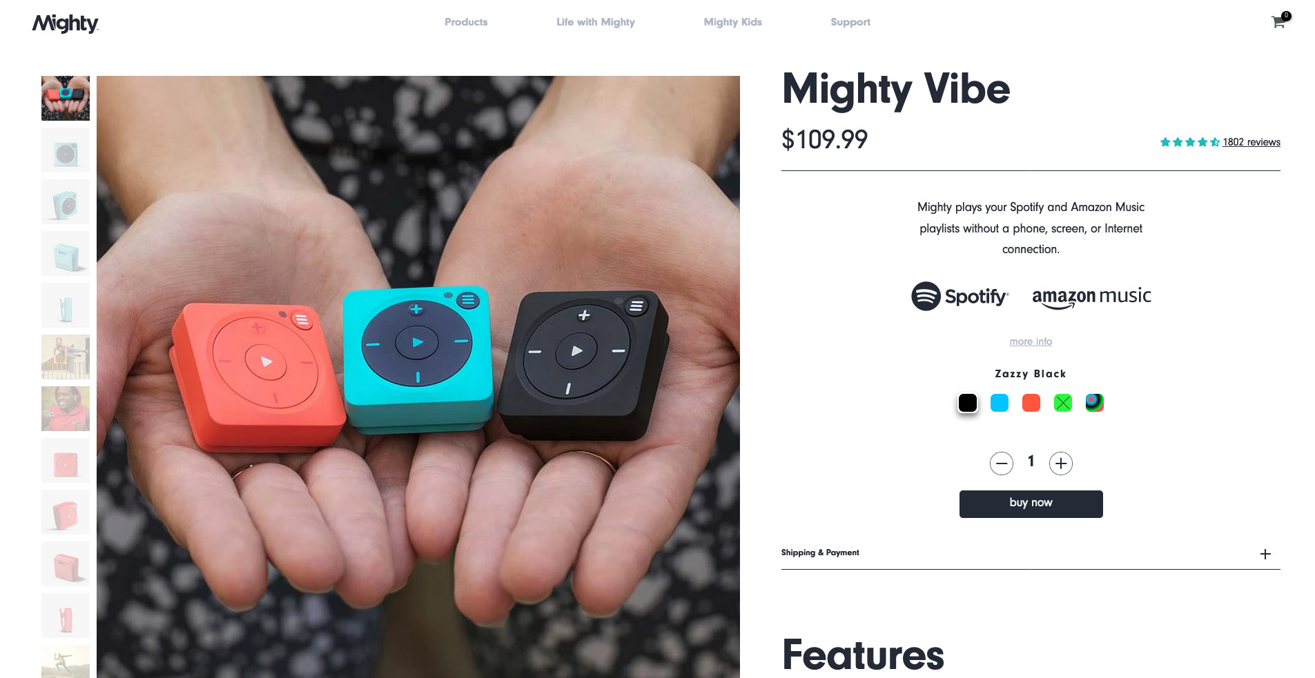
Right from the top of their product pages, the Mighty is shown in full colour and in hand, illustrating it’s size and feel immediately. Product options in the gallery are framed to the left, rather than the bottom, adding more emphasis on the gallery than the traditional position below, and allow this customer to see it in use, zoom in and inspect it’s finer details. In fact, there’s not a single photograph on the page that doesn’t showcase the product in use.
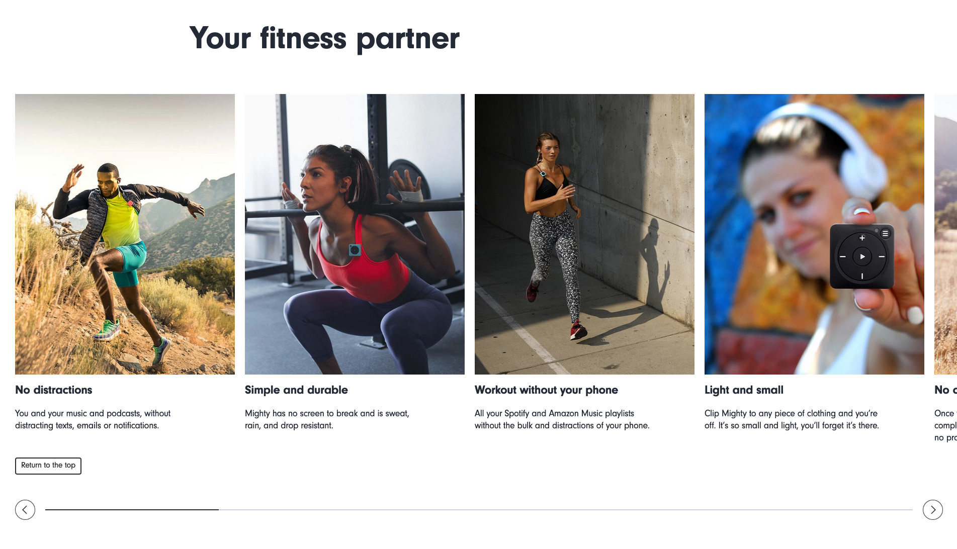
The user experience on the Mighty’s product pages is smooth and concise, using photographs effectively to convey size, ease of use, range of functions and much more. By pairing these images with spare copy, they’ve created a great experience and a great sales tool to create happy customers.
Why it works:
Showcasing the product through images is key
Product images are incredibly important when it comes to the conversion rate of your product page.
Baymard Institute discovered that 56% of users immediately started exploring product images after arriving on the product page. Surprisingly, that research revealed that 25% of E-Commerce sites failed to provide product images that met the user’s needs.
Here are the three key things that you need to pay attention to:
- Image resolution: It’s been found that users extend their disappointment beyond the specific product that they are viewing to the site or brand. Low-quality images affect not only how people perceive a particular product but also how they perceive the brand that sells it.
- Zoom-in functionality: 93% of ecommerce desktop sites allow users to zoom in on some or all product images. However, on some of the sites the level of zoom on the images is insufficient to see the visual details required to make the purchase decision. This leads some users away from the product page since they can’t get a rich visual understanding of crucial product details. Also, consider offering additional features such as the ability to rotate the image to see the product from different angles.
- Images of the product in use: Showing the product on a plain background may not be enough: for brands in lifestyle, fashion or home electronics you will absolutely want to show the product naturally in the real world on your product pages. For best results, always try and produce original content. Don’t rely on using mockups or stock photography unless it fits your design system.
The takeaway here is that you need to allow online shoppers to visually examine the product if you want them to feel confident enough to buy it. By blending your product images with your brand identity, you’ll be able to do just that. Mighty’s example above is a perfect example of how to use product photos effectively.
#2: Studio Neat
Great product pages focus on supplying shoppers with all the information they need to make a purchase. Studio Neat exemplifies putting your brand front and centre through the combination of all four main ingredients we listed above.
With beautiful long-from product pages, which includes video, big, bold social proof in the form of quotes, product photos that stick to brand guidelines and casual, confident copywriting, this brand understands their audiences love of words, of clean and classic design, and of simplicity.
When you first land on a page, you’re greeted by a video explaining more about the brand and its products.

By naturally continuing down the page, the audience is shown social proof and key reasons why you should buy the featured product. The descriptions are catchy, speak in the voice of the brand, and are paired with high quality images to make a customer imagine they’re enjoying the product already. This is a great example of user experience that is both enjoyable and on brand.
Highlights of product features are broken out and highlighted, rather than simply listed in a dense block of text: remember what we said about giving the right information on your product pages? Studio Neat’s design understands this perfectly as shown below.

These product pages finish off with a series of ” in the wild” photos to highlight the product in everyday use, but also (and most importantly) they reinforce the brand’s identity through the locations, colours and surrounding accessories. It’s this section that brings it all together and offers an excellent “one shot” approach to connecting with customers who hit that landing page as their first touchpoint with your brand.

Why it works:
Branding is everything.
If we marketers know one thing, it’s the importance of branding.
Emphasizing your brand identity can actually be the most important part of your product pages, says Mark Perini, Founder of ICEE Social.
“The difference between creating a mediocre product page and a stellar product page is your ability to weave your brand’s DNA into the page. As a visitor, as soon as I land on the product page I want to know within two seconds what your brand is all about.”
Branding is much, much more than a few photos or a Shopify theme. If your company fails to build that elusive connection with it’s audience, be it through a bad website experience, boring design, confusing or low quality information, or even a lack of visibility in your market, consumers will move on to another brand or product without a second thought.
Make no mistake, we know that’s exactly what your audience will do: according to an Kissmetrics, 61% of customers take their business to a competitor when they end a business relationship, and with multiple touch-points along your customer’s journey the chance to drop the connection is ever present.
With this sobering statistic in mind, here are 3 key reasons why focusing on branding helps build product pages that work.
- Branding your product pages improves recognition: Of course your brand includes both visual elements (logos, photos and such), but it’s the almost ephemeral associations people make with your products and services through non-visual interactions that create a brand identity. The more memorable your logo design or colour choices are the better, but your customer service, checkout options, testimonials, shipping, charity associations or environmental ethos are even more likely to help customers make those positive associations. And as long as those associations are positive, customers will buy, keep buying and provide positive social proof in the future through recommendations or evangelism.
- Branding your product pages helps you create connections that count: Building a brand helps you to create trust with your target market, and helps to create brand loyalty, according to an article by The Branding Journal. By evoking positive feelings within a person, they will feel more comfortable doing business with you, and continuing to do business with you. Here, your tone and copy become essential to convey that you and the customer are connected through more than just the purchase. By incorporating lifestyle imagery, particular models or situations, you can help drive home the values of your brand and the place it fits in your customer’s lives.
- Branding shows that you’re put-together: People notice if you put time and effort into your brick-and-mortar business, and your online presence should be no different. If your store is dim, dirty and disorganized, we both know you’ll fail as a business. The same goes for your branding. If you (or your agency) create an engaging, focused and effective brand throughout your product pages, as Studio Neat has done, it will help connect with the customer, establish trust and help reduce friction to that all important conversion.
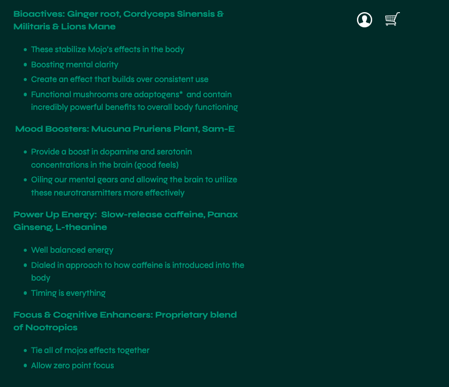
#3 Mojo Gummies
Mojo is a groundbreaking product from Gwella, a startup focused on bettering mental health through the power of functional mushrooms.
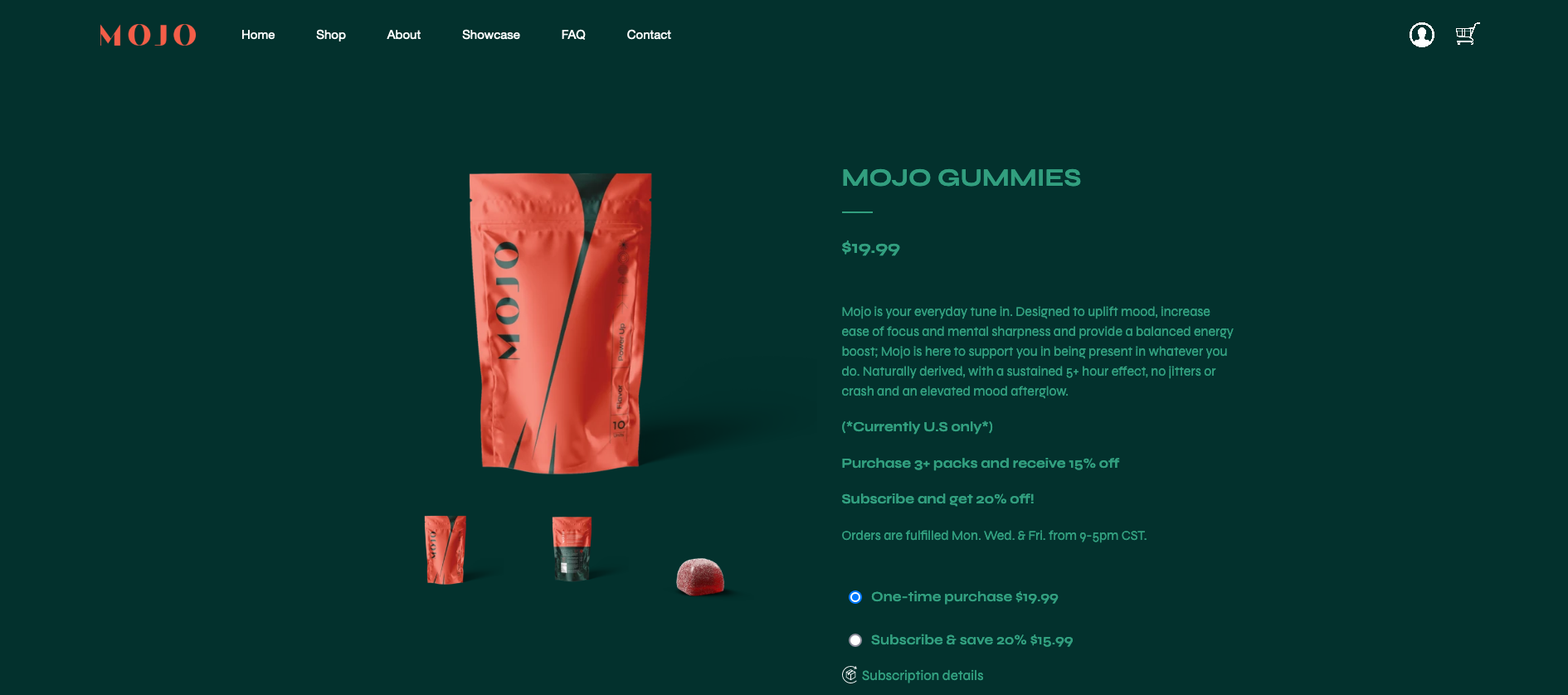
By highlighting their bold, beautiful packaging against a rich, green background colour, Mojo immediately establishes their brand identity along the axis of the natural and the now, with on-trend typesetting and design front and centre. Close-up shots highlighting the details of the product allow the customer to imagine having it in hand.
Mojo also doesn’t clutter up the page with heavy amounts of text: for the more curious shopper the ingredients and what they do are presented after the buy button:
Why it works:
Copywriting: Mojo gives customers the right amount of information
Beyond the design, Mojo’s product pages include a few key elements to help the curious decide if they want to try:
- Short, descriptive product information, available at the customer’s discretion instead of before the buy button
- Discounts for volume and subscription up-front before the checkout, giving the customer confidence in the product
- Shipping policy / ship dates to show transparency and build trust
With a product so new and in a industry with a lot of buzzwords and jargon, it can be daunting to new customers to be confronted with acronyms and technical terms they may not understand. Mojo smartly places this information further down the product page to not put off potential customers with too much, too soon.
Copywriting isn’t always slogans and sales pitches, it’s also important to deliver your products benefits, ingredients, instructions or other info as quickly and understandably as possible.
#4 Lindt
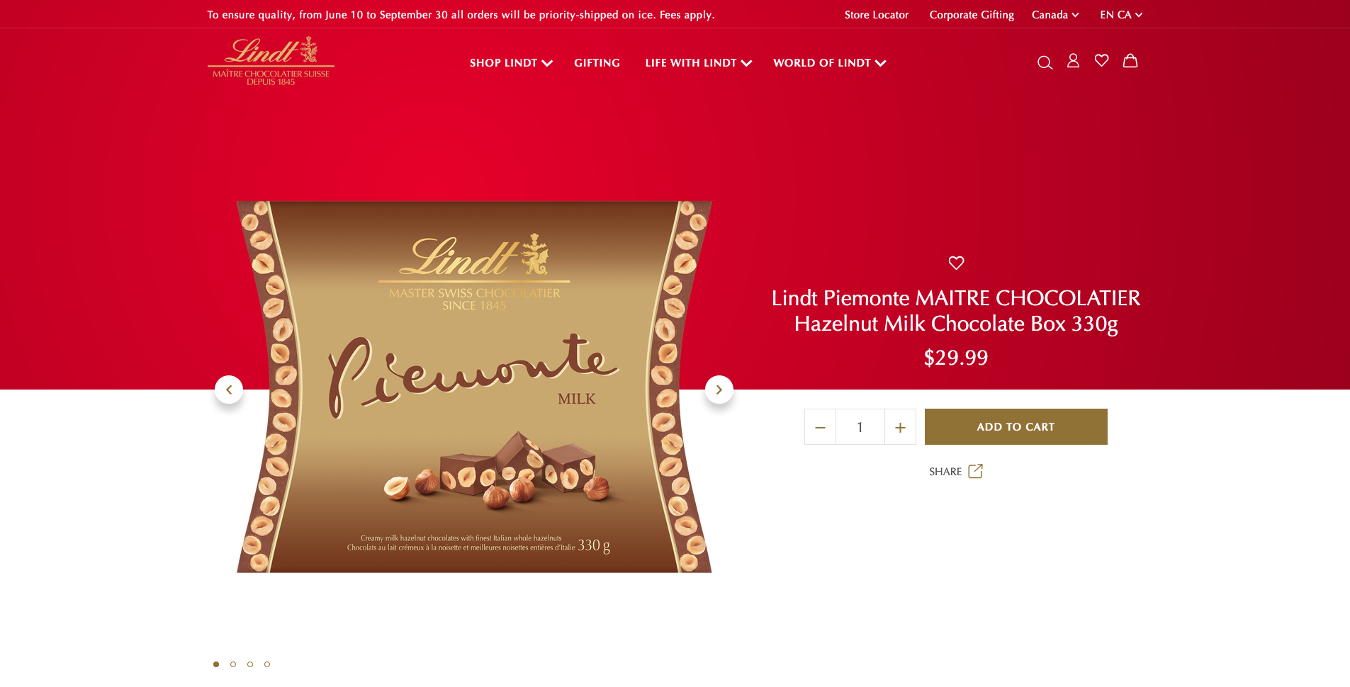
Lindt is a chocolate maker with over 150 years of history and a reputation for quality. A recent convert to E-Commerce, Lindt smartly puts their recognizable packaging up-front and let’s their photography tell the story. This product page shows how the right amount of information can have more impact rather than having the most information, and why an up-front call to action can help drive your desired outcomes.
Design wise, by splitting the page in half and placing the product between two distinct colours, Lindt cleverly showcases both their brand identity and draws the eyes to their product by utilizing the white space on the page.
Further down, their copy tells the company’s history and engages the customer by having them imagine the sensation of enjoying the product, a great way to use text to help create interest without cold hard facts. The footer of the page cleverly keeps a persistent “add-to-cart” banner to keep the product purchase at the front of mind for the shopper, making the key conversion (add-to-cart) always present.
Why it works
User experience: It’s all about that call-to-action (CTA) button
It’s not rocket science: You should make it clear to potential customers what you want them to do next, which is the purpose of the call-to-action (CTA) button. For your brand’s product pages, you will want your visitors to add a product to their basket, or potentially sign up for a subscription, or even get a quote….there’s not much more to do in 99% of E-commerce transactions…but getting that conversion is the hardest part of the entire process.
While it can be tempting to be clever or “over design” the experience, research by Hubspot has shown that personalized CTAs that appear as buttons perform far better than images.

Typically, ecommerce stores use the phrase “Add to Cart” as the CTA button copy. That being said, feel free to experiment and conduct A/B tests to find which is the most effective CTA for your products, such as “Buy Now”. What works for one company may not work for yours: the key is to make it central to your product pages’ experience, not an afterthought.
User experience is often confused with the visual design of your product pages, but in reality it’s the path your customers take that’s most important, not the scenery. By showcasing a clear, bold, customized CTA you can guarantee both you and the customer get the desired interaction from your product pages. Lindt does this by putting their both above the fold on their product pages and as a persistent footer, giving the customer a constant, but gentle reminder of where to go next.
#5 Perfect Keto
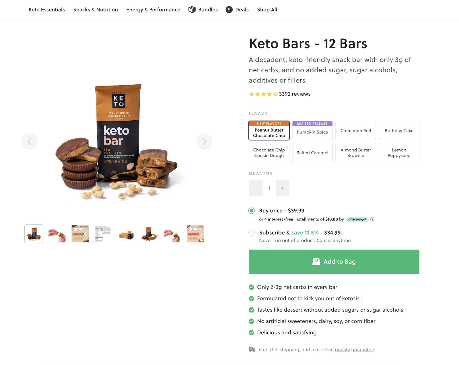
Perfect Keto checks off many boxes for having great product pages. It helps give shoppers the information they need as quickly as possible, uses a descriptive product title to answer questions before they’re asked, puts the reviews at top of mind, highlights the product immediately through great photography and ties it all together in a clean, clear and concise way.
The brand is also showcased through great “in the wild” photography that allows the customer to imagine the product in hand, in their home and their daily lives, paired with the added benefit of answering “what is it for” or “how do I use it”.
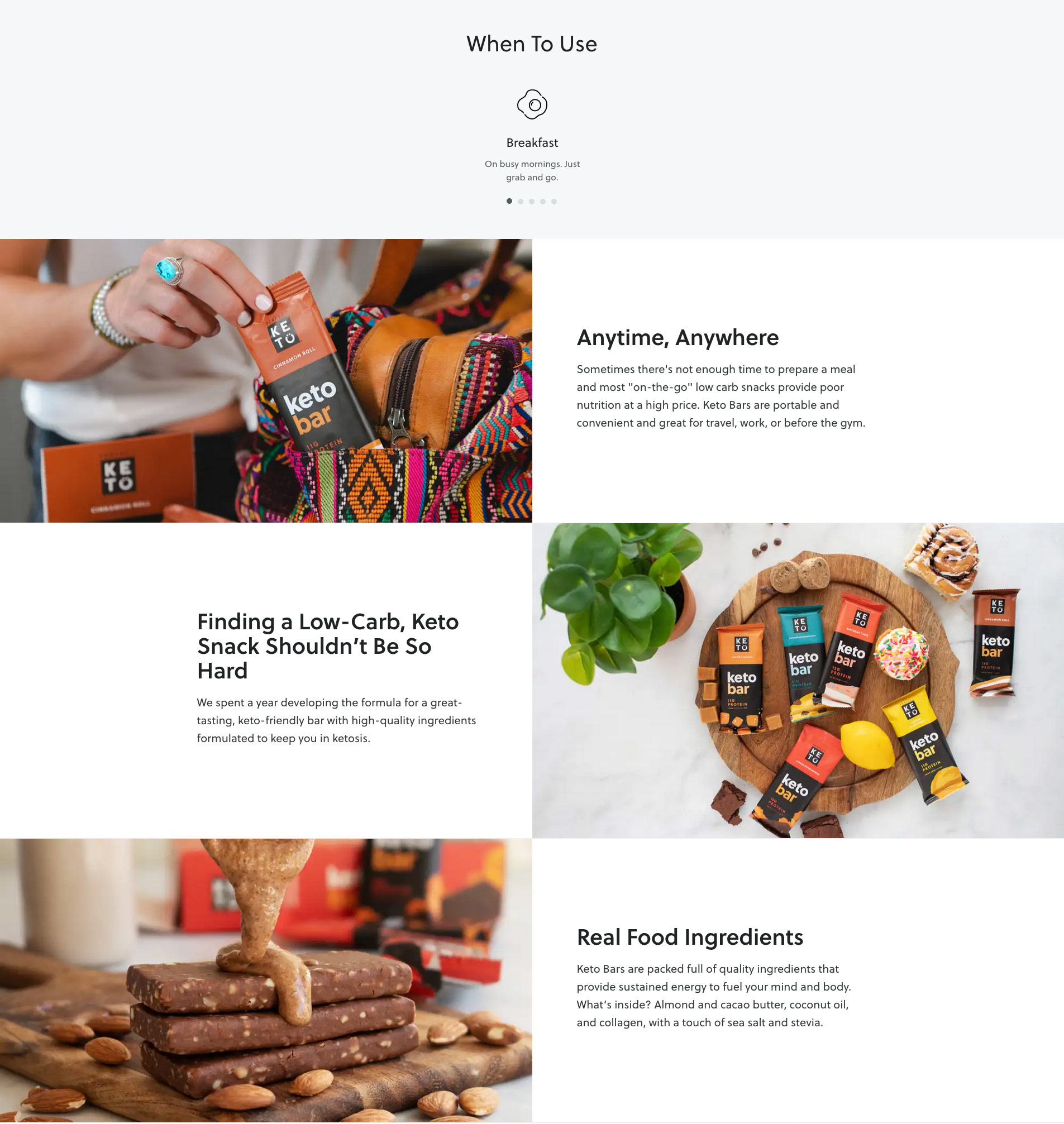
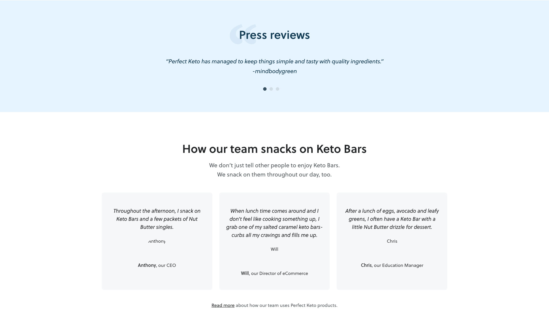
But where Perfect Keto really shines is in their choice to elevate the social proof of their product pages by not only having traditional customer reviews, but also press and staff testimonials. This is going above and beyond what’s required and really drives home that all important trust in a customer.
Why it works:
You need social proof reviews on your product pages
Social proof is a theory, popularized by psychologist Dr. Robert Cialdini, that describes our tendency to rely on the opinions or actions of others to guide our own.
Whether you’re familiar with social proof or not, chances are it has influenced decisions—both big and small—throughout your life. Leveraging the appeal of following the “wisdom of the crowd,” social proof captures our attention because we’re naturally curious about what’s happening, why it’s happening, and what the correct behaviour or response is.
Potential customers care less about what you say about your product and more about what other people say about it.
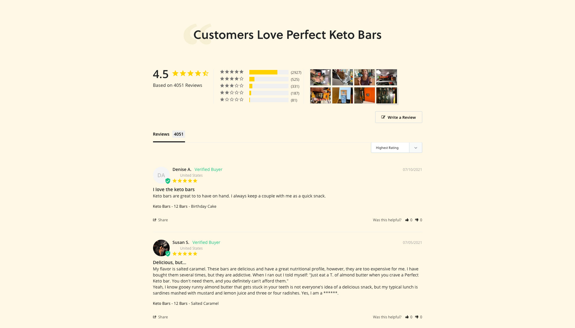
That’s why displaying customer reviews can have a drastic impact on the conversion rate of your product page. According to Spiegel Research Center, the purchase likelihood of a product with 5 reviews is 270% higher than that of a product with zero reviews:

However, as you can see, the effect the number of reviews has on the conversion rate isn’t linear: the marginal benefit of additional reviews starts diminishing after the first five reviews, so as always it’s about the right amount of information presented by your product pages. (If you want more sources of social proof, read on to our next example for other options)
Keep in mind that when it comes to customer reviews, it’s important to make sure that they don’t come across as fake. Here’s what Spiegel Research Center found:
“Is five stars “too good to be true” in the eyes of consumers? According to our research, it is. Across product categories, we found that purchase likelihood typically peaks at ratings in the 4.0 – 4.7 range, and then begins to decrease as ratings approach 5.0.”
So make sure that your product pages have at least five customer reviews and don’t delete negative reviews should you get any. While it can be tempting to moderate your reviews and leave only the highest compliments, your product pages will actually suffer without them.
In fact, this final example may be our best, here’s why:
Perfect Keto’s product pages bring all 5 elements together:
- The brand is highlighted with their product photography, typesetting, copy and colours.
- Showing social proof: curious customers are always more likely to try if there’s testimonials easily accessible, and Perfect Keto goes above and beyond with 3 different sources.
- High quality product photography that highlights the product and packaging, as well as showing the product in day to day use.
- Communicating product benefits with a bulleted list rather than a more “story telling” approach shows the right approach to copy-writing, but dense with information for those that need it.
- Immediately delivers the benefits directly under the product title (which in of itself is great; short and descriptive), has a customized CTA, offers subscription and shipping instantly plus other small touches makes for great user experience.
Conclusion
It’s not as simple as choosing one of these ingredients and calling it a day. Your product page is always going to be a balance between all of these factors, and it’s going to evolve as you go.
You’ll need to understand your customer and have a solid brand identity in place to make it work.
Each of our examples above exemplifies one of the keys of great product page design, but as always without a true understanding of your customer and their needs, you won’t be able to make the right choices to use each of those ingredients the right way. Mighty knows their audience is looking for simplicity and durability and delivers that information through great photography, while Perfect Keto customers may need a little more convincing of it’s taste or quality through social proof. Every brand is different, and will need to learn what helps their customer to complete their journey and adjust their product pages accordingly.
By including these five ingredients we’ve outlined above in the right amounts, you’ll be on your way to making your e-commerce site not only sell more, but help build your brand for years to come.
Still need a hand in building a great brand online? Give us a shout!